Learn UX

Gain practical User Experience knowledge so you can make better work.

August 19, 2015 By Brendan Leave a Comment

DIY User Testing: Testing Plan

As with many activities in UX, with user research, we move from broad to specific. And, the first broad thing we do is to write out our overall ‘plan’ for the research. This is called a “Testing Plan” and it’s a helpful tool for us, which will keep us focused, and build alignment with our colleagues as we move ahead with the research.

To create a “Testing Plan” for yourself, make a document and include a heading for each step below. Then flesh it out as needed to relate to your project.

Step 1: Identify Research Goals

Generally speaking, you need to know about the: attitudes, behaviors, needs and goals of your users, but it will help you to get more specific when you write down your goals. To do this, work on answering the questions below:

What do you want out of this research?

What do you need to know about your users? (ex. How are they performing this task? What are the big pain points users have?)

Ex. If you were working for a pet insurance site, doing exploratory research, your testing plan might include “goals and objectives” like these:

Identify what the shopping process looks like.

identify unmet informational needs.

learn about motivation going into the shopping process.

etc.

Step 2: Define Users

Who do you need to talk to to get your questions answered?

Ex. Responsible pet owners, who make the primary decisions about their pets care, don’t have pet insurance, but can afford pet insurance.

Step 3: Define Screening Criteria

What do you need to know about candidates to determine if they would be a suitable participant for you to speak with? (Think about what questions would they need to answer for you to determine this. More on screening and recruiting can be found here.)

Ex.

“Do you have a pet?” (Determines if they have a pet.)

“When was the last time your pet went to the vet?” (Determines if they are responsible.)

“Who usually takes your pet to the vet?” (Determines if they the main care-taker / decision-maker.)

“What do you think of pet insurance?” (Reveals their attitude about the product.)

“Do you have it?” (Determins if they have it or not.)

“What’s your approiximate household income?” (Determines how much they make and we can decide if they qualify as someone who can afford this. Ex. We’re only looking for people who make $60,000 and up because we saw on a remote analytics tool that our clients pet insurance site gets most of it’s traffic from people who make $60,000+)

Step 4: Summarize Proceedure

How will you be conducting the research?

Ex.

1-on-1 interviews with participants in a cafe, using quicktime to record their actions.

or

Intercept interviews at a Dog Park (would be good to learn about attitudes, but bad to observe people doing tasks on a computer.)

etc.

Step 4: Write Research Questions & Define Tasks

What questions will uncover unmet needs? What tasks do you want participants to conduct?

Ex.

Question:

Do people accurately understand how pet insurance works?

Task:

Have participant describe what they think it is.

Question:

How do they research pet insurance?

Task:

Have participant research pet insurance.

Question:

What information do they need in order to make a purchase decision?

Task:

Ask a participant to shop for insurance that would be right for thier pet.

etc…

Here’s a link where you can download and view some examples of user testing documents, like a testing plan.)
Filed Under: Uncategorized

August 19, 2015 By Brendan 1 Comment

DIY User Testing: Recruiting & Screening

In an agency, you often have the luxury of money, allowing you to hire a facility and access a database of pre-screened candidates, you can query against to find people who match your participant criteria.

But when you are doing it on your own, that’s not a real option for you because of the high cost.

Here’s a brief overview of the DIY process I use to recruit and screen participants for user testing sessions, which I conduct as a startup/freelance hustler:

First, figure out your the goals of your research and what you want to learn. (A great way to do this is to make yourself a Testing Plan ).

Then post an ad on craigslist for participants in a web study. In your post ask people to fill out a “quick form”, review the form as people enter their information, and follow up with the ones who meet your criteria.

Here’s a real world example:

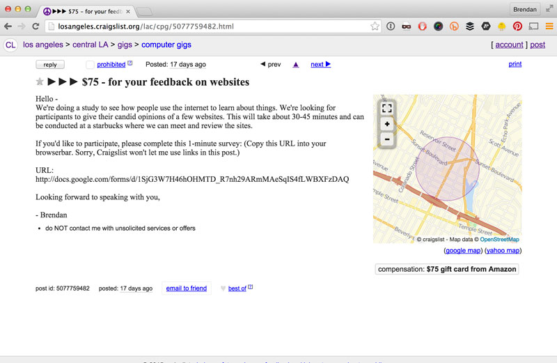
I needed to recruit people for user research on a life insurance site, so I posted this ad, offering people a gift card (which is tax deductible, because it’s a gift) in exchange for 30-45 minutes at a mutually convenient Starbucks.

Here’s the ad I posted:

CL_ad

Here’s a link to the live screener I used. Google allows you to create forms with some conditional logic to make your intentions less obvious, which is helpful. Here’s a PDF so you can see behind the curtain how I constructed that logic.

I was looking for the following:

People who might actually buy our life insurance product:

  • People either married and/or with kids
  • 25 – 44 years old
  • 40k-90k individual income (if they made more, we couldn’t issue a policy big enough for them.)
  • People who didn’t have any bad biases against life insurance (hence the “Why don’t you have it?”)

People who didn’t have life insurance were preferable, but hard to find, so about half of our participants ended up actually already having it, and that wasn’t a problem. We also ended up accepting people with a little less/more annual incomes, because they were good matches with the other criteria. I’ve pasted some example responses here so you can see what the survey data looks like as people fill it out. (The green one is an example of what we were looking for. The yellow one was not optimal, but was usable.)

Protips:

You’ll notice in the screener there are questions we don’t care about at all, like if they have home/renters insurance. Questions like that were just there so that it wouldn;t be too obvious that we were focused on life insurance. (For instance, if you only ask a person who wants to get paid “Do you have life insurance?” they might fill out the form twice and answer “Yes” once and “No” the second time.

You can also google the email address the person gives you and see if anything scandalous comes up. Ha! (I have found out several rascals this way.)

Hope this was helpful. Please let me know!

Filed Under: Uncategorized

August 15, 2015 By Brendan Leave a Comment

Improve your product by improving your navigation

Are you redesigning your site or app and thinking about your new structure? Here’s a list of some of the important trends we’re currently seeing related to navigation and navigation systems. Hope this info is helpful!


1. The three click rule is dead.

“A path with 5 easy clicks is vastly superior to one with 3 difficult clicks.” – Jacob Neilson [link] Reducing the number of clicks, or steps a user takes, is only the right thing to do when it reduces the complexity of the overall experience.


2. Less is more

Whether you’re buying products or selecting an item to click, choosing from multiple options is taxing, and increases in difficulty as you add more options. [link] When possible, reduce the number of options you present to users in order to help them build momentum, feel smart, and make quick choices.


3. Use standard “layman’s” language

Link labels should be easy to understand.  A menu with 10 easily understood items is better than a menu with 7 obscure ones. Complex phrases and terms take longer to comprehend, and slow users down. Ensure your choice of labels are intuitive, distinct, and don’t mislead or over promise. Users should be able to confidently predict what they’ll get if they click. [link]


4. Make it ‘Feel’ fast & easy.

The real question is not how many items are there. Nor is it how many clicks does it take to get to your destination. The real question is “Does it feel easy?” Deliver an easy experience to users by being simple, understandable, and fast. This will make interacting with you an attractive proposition.


5. Think Multiplatform

Your users reach you from various different contexts and devices. Try to make life easier for them by considering ways you can leverage what you already know about each other from one channel to the next. Also look for ways to meet their unique needs, specific to each context and device. Ex. AT&T and Verizon both use a similar navigation on their mobile websites as their desktop sites (leveraging user familiarity). They also elevate ‘find a store’ which is appropriate for the on-the-go mobile user (context appropriateness).


6. Content-heavy dropdowns

Many sites use larger navigation dropdowns to give users a sense of the depth of content and the latest and most popular items. The most successful examples have clear structures that do not vary greatly from one panel to the other. Ex. Mini Usa


7. Login is on the right, near the top

We read left to right, top to bottom, making the top corners of any screen important real estate. But, whatever the original reason (it’s self-perpetuating now) most websites have the login form on the right-hand side of the page. Therefore, if you’re striving for the goal of “don’t make me think,” It’s a good idea to put login on the right near the top.


8. Context aware navigation

As technology evolves, we continue to see new exciting ways to customize and personalize user experiences. Available data points, like location, current page, clicksteam, and saved personal information help power these contextual customizations. Navigation is one of many places we can use this data to make things feel easier, smarter, and faster.


Thoughts on these? Anything else you think should be included? Let us know in the comments!


Filed Under: Uncategorized

Get fresh content to build your skills and elevate your career!

Consider Reading

How do I become a UX designer?

Consider Reading:

DIY User Testing: Testing Plan

DIY User Testing: Recruiting & Screening

Improve your product by improving your navigation

Nice to meet you!

Bolton-Klinger has taught UX classes at Pratt Institute, School of Visual Arts, and University California Los Angeles. He is cofounder of several funded startups, and was previous an Experience Lead at Huge, specializing in the design of digital experiences, ranging from of mobile apps, to large transactional and content sites. When not UX-ing or teaching, he keeps busy herding toddlers and dogs.

Copyright © 2025 · Learn UX